Advanced Column
Unique features you love
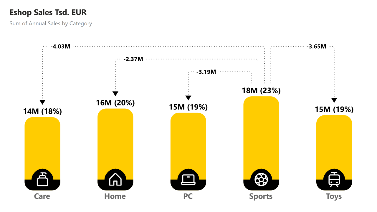
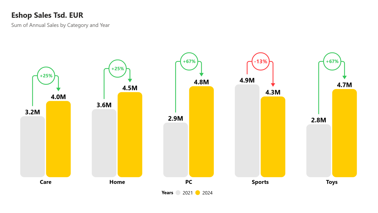
Advanced Column is easy to use column chart for comparing one or more values with clearly interpretable difference lines. It is best suited for comparison of values between time periods, categories or quantities.
Get TrialDifference Lines
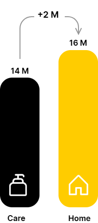
to clearly show difference above compared columns with values in specific shapes, all configurable (percentage/absolute difference, colors, borders, rounded corners, ...)

3 IN ONE
Chart types - stacked, clustered and nested types of chart at your disposal with multiple formatting options.
Visualize differences your way – flexible and powerful settings
Shapes
Lines

Take customization further with rounded lines, color of values, shapes, lines conditional formatting, and more
Symbols
Values
TOP SELECTIONS
Easily select and display top-ranked values with no extra filtering needed.
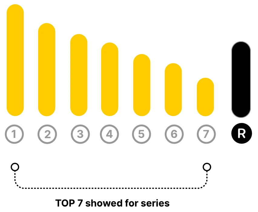
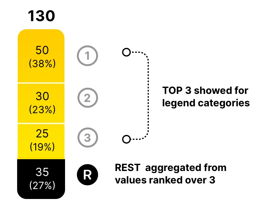

CHART EXAMPLES
Designers can choose from three chart types: stacked, clustered, and nested.
Difference Lines and Top Selection work seamlessly across all of them.
Enjoy extensive formatting options, including the use of icons with rich customization.
Live demo


1000+ Icons
Total Column
Easily add a Total Column that sums all columns in the chart, with full control over its position, spacing, and calculation method — including SUM, AVG, MIN, MAX, or COUNT — to clearly highlight overall results.
Sorting segments
The visual lets you easily sort stacked segments by size — from largest to smallest — using built-in settings, without needing to pre-sort your data. This improves clarity and works across Stacked, Clustered, and Nested layouts.
Enhanced Labels
Enhanced Labels let you display values alone or combine them with percentage shares — such as '12k (23%)'. You can choose whether the percentage is calculated based on the total or per individual column, and apply this to both data and total labels.